As Automattic CEO Matt Mullenweg teased in a January blog post, our team at WordPress.com is working hard to enhance our developer experience. Improving what you see in your dashboard when you log into WordPress.com is one of our biggest goals.
Today, we’re excited to unveil a more powerful wp-admin experience (if you know, you know), which will soon be available to all sites on Creator and Entrepreneur plans. Read on to find out how to get early access.
Don’t call it a comeback
For many years, the default view for WordPress.com users has been a modernized, more friendly version of the classic WordPress experience. Around the office, we call this interface “Calypso.” It offers sleek post/page management, easy profile edits, built-in tips and resources for starting or growing your site, and more.
While the Calypso interface is ideal for some folks, we’ve heard from a lot of developers that you’d prefer easy access to the classic WordPress dashboard experience. So, we’re doing just that by making it possible for wp-admin to be the default view when you log in.
Our mission here is to empower our power users—those on Creator and Entrepreneur plans—to leverage WordPress to its fullest. This update promises:
Enhanced flexibility: Tailor your interface to seamlessly match your workflow.
A familiar, WordPress-centric experience: Enjoy an interface that feels right at home, mirroring the robust capabilities you expect from other WordPress hosts.
Superior management for complex sites: Handle sophisticated sites and client projects with ease.
While this initial launch is for Creator and Entrepreneur subscribers, our commitment extends to all WordPress.com users. We’re excited about the possibility of expanding these features to everyone in the future.
Join the early access list
To access the wp-admin interface you know and love, please join our email list below to be considered for early access.
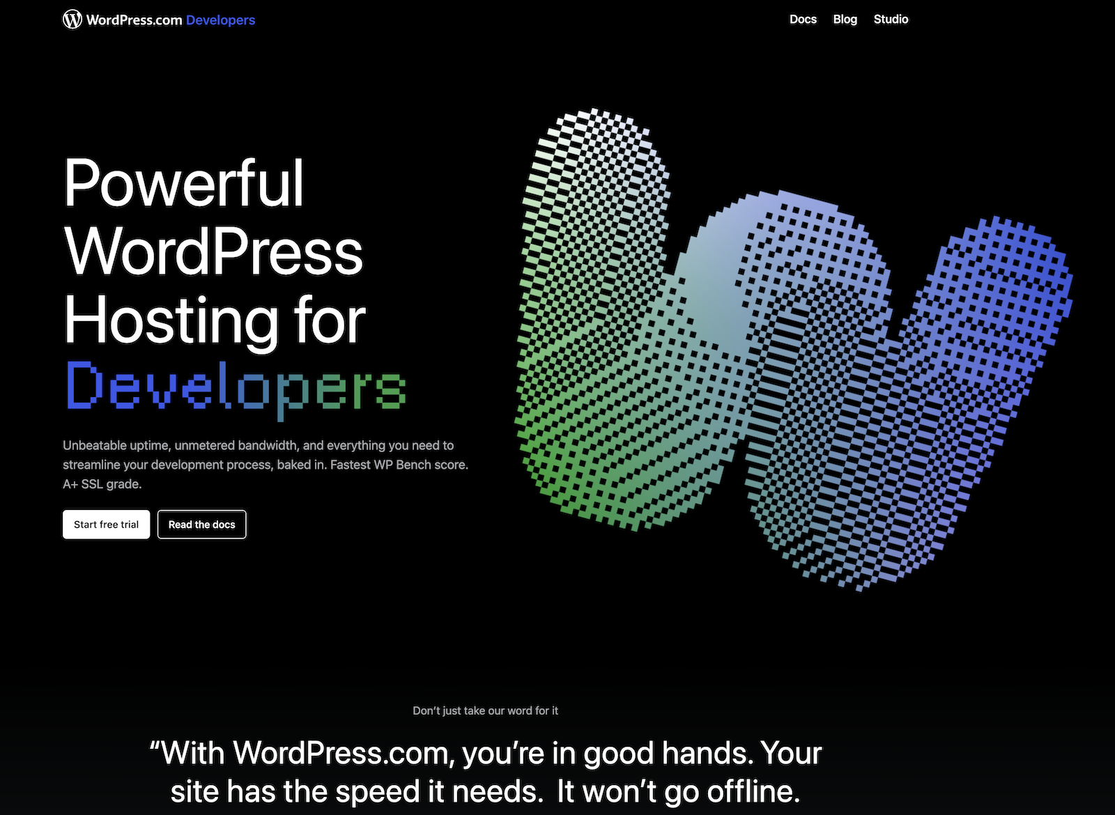
In the last few weeks, our team here at WordPress.com has rebuilt developer.wordpress.com from the ground up. If you build or design websites for other people, in any capacity, bookmark this site. It’s your new home for docs, resources, the latest news about developer features, and more.
Rather than creating a unique, custom theme, we went all-in on using Twenty Twenty-Four, which is the default theme for all WordPress sites.
That’s right, with a combination of built-in Site Editor functionalities and traditional PHP templates, we were able to create a site from scratch to house all of our developer resources.
Below, I outline exactly how our team did it.
A Twenty Twenty-Four Child Theme
The developer.wordpress.com site has existed for years, but we realized that it needed an overhaul in order to modernize the look and feel of the site with our current branding, as well as accommodate our new developer documentation.
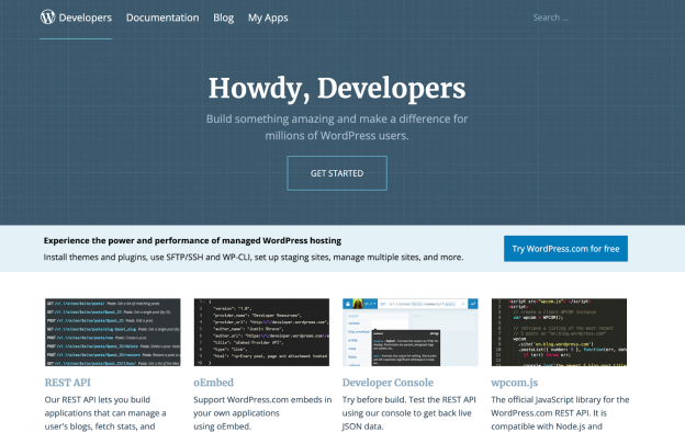
You’ll probably agree that the site needed a refresh; here’s what developer.wordpress.com looked like two weeks ago:
Once we decided to redesign and rebuild the site, we had two options: 1) build it entirely from scratch or 2) use an existing theme.
We knew we wanted to use Full Site Editing (FSE) because it would allow us to easily use existing patterns and give our content team the best writing and editing experience without them having to commit code.
We considered starting from scratch and using the official “Create Block Theme” plugin. Building a new theme from scratch is a great option if you need something tailored to your specific needs, but Twenty Twenty-Four was already close to what we wanted, and it would give us a headstart because we can inherit most styles, templates, and code from the parent theme.
We quickly decided on a hybrid theme approach: we would use FSE as much as possible but still fall back to CSS and classic PHP templates where needed (like for our Docs custom post type).
With this in mind, we created a minimal child theme based on Twenty Twenty-Four.
Spin up a scaffold with @wordpress/create-block
We initialized our new theme by running npx @wordpress/create-block@latest wpcom-developer.
This gave us a folder with example code, build scripts, and a plugin that would load a custom block.
If you only need a custom block (not a theme), you’re all set.
But we’re building a theme here! Let’s work on that next.
Modify the setup into a child theme
First, we deleted wpcom-developer.php, the file responsible for loading our block via a plugin. We also added a functions.php file and a style.css file with the expected syntax required to identify this as a child theme.
Despite being a CSS file, we’re not adding any styles to the style.css file. Instead, you can think of it like a documentation file where Template: twentytwentyfour specifies that the new theme we’re creating is a child theme of Twenty Twenty-Four.
We removed all of the demo files in the “src” folder and added two folders inside: one for CSS and one for JS, each containing an empty file that will be the entry point for building our code.
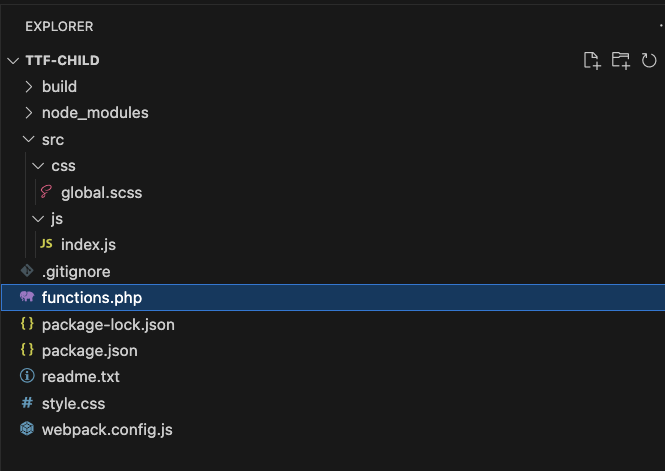
The theme folder structure now looked like this:
The build scripts in @wordpress/create-block can build SCSS/CSS and TS/JS out of the box. It uses Webpack behind the scenes and provides a standard configuration. We can extend the default configuration further with custom entry points and plugins by adding our own webpack.config.js file.
By doing this, we can:
Build specific output files for certain sections of the site. In our case, we have both PHP templates and FSE templates from both custom code and our parent Twenty Twenty-Four theme. The FSE templates need minimal (if any) custom styling (thanks to theme.json), but our developer documentation area of the site uses a custom post type and page templates that require CSS.
Remove empty JS files after building the *.asset.php files. Without this, an empty JS file will be generated for each CSS file.
Our webpack.config.js ended up looking similar to the code below. Notice that we’re simply extending the defaultConfig with a few extra properties.
Any additional entry points, in our case src/docs, can be added as a separate entry in the entry object.
// WordPress webpack config.
const defaultConfig = require( '@wordpress/scripts/config/webpack.config' );

// Plugins.
const RemoveEmptyScriptsPlugin = require( 'webpack-remove-empty-scripts' );

// Utilities.
const path = require( 'path' );

// Add any new entry points by extending the webpack config.
module.exports = {
	...defaultConfig,
	...{
		entry: {
			'css/global':  path.resolve( process.cwd(), 'src/css',   'global.scss' ),
			'js/index': path.resolve( process.cwd(), 'src/js', 'index.js' ),
		},
		plugins: [
			// Include WP's plugin config.
			...defaultConfig.plugins,
			// Removes the empty `.js` files generated by webpack but
			// sets it after WP has generated its `*.asset.php` file.
			new RemoveEmptyScriptsPlugin( {
				stage: RemoveEmptyScriptsPlugin.STAGE_AFTER_PROCESS_PLUGINS
			} )
		]
	}
};
In functions.php, we enqueue our built assets and files depending on specific conditions. For example, we built separate CSS files for the docs area of the site, and we only enqueued those CSS files for our docs.
We didn’t need to register the style files from Twenty Twenty-Four, as WordPress handles these inline.
We did need to enqueue the styles for our classic, non-FSE templates (in the case of our developer docs) or any additional styles we wanted to add on top of the FSE styles.
To build the production JS and CSS locally, we run npm run build.
For local development, you can run npm run start in one terminal window and npx wp-env start (using the wp-env package) in another to start a local WordPress development server running your theme.
While building this site, our team of designers, developers, and content writers used a WordPress.com staging site so that changes did not affect the existing developer.wordpress.com site until we were ready to launch this new theme.
theme.json
Twenty Twenty-Four has a comprehensive theme.json file that defines its styles. By default, our hybrid theme inherits all of the style definitions from the parent (Twenty Twenty-Four) theme.json file.
We selectively overwrote the parts we wanted to change (the color palette, fonts, and other brand elements), leaving the rest to be loaded from the parent theme.
WordPress handles this merging, as well as any changes you make in the editor.
Many of the default styles worked well for us, and we ended up with a compact theme.json file that defines colors, fonts, and gradients. Having a copy of the parent theme’stheme.json file makes it easier to see how colors are referenced.
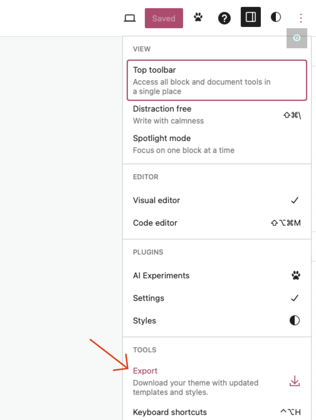
Why might you want to export your editor changes? Styles can then be transferred back to code to ensure they match and make it easier to distribute your theme or move it from a local development site to a live site. This ensures the FSE page templates are kept in code with version control.
When we launched this new theme on production, the template files loaded from our theme directory; we didn’t need to import database records containing the template syntax or global styles.
Global styles in SCSS/CSS
Global styles are added as CSS variables, and they can be referenced in CSS. Changing the value in theme.json will also ensure that the other colors are updated.
For example, here’s how we reference our “contrast” color as a border color:
border-color: var(--wp--preset--color--contrast);
What about header.php and footer.php?
Some plugins require these files in a theme, e.g. by calling get_header(), which does not automatically load the FSE header template.
We did not want to recreate our header and footer to cover those cases; having just one source of truth is a lot better.
By using do_blocks(), we were able to render our needed header block. Here’s an example from a header template file:
' );
?>

>
The new developer.wordpress.com site is now live!
Check out our new-and-improved developer.wordpress.com site today, and leave a comment below telling us what you think. We’d love your feedback.
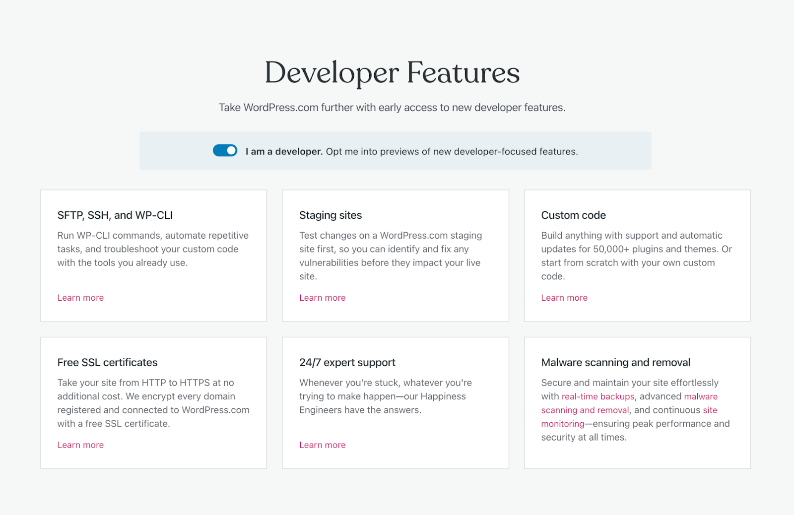
Using custom code and staging sites are just two of the many developer features available to WordPress.com sites that we used to build our new and improved developer.wordpress.com.
If you’re a developer and interested in getting early access to other development-related features, click here to enable our “I am a developer” setting on your WordPress.com account.
Halfway through a relaxing winter break with my family, I opened Slack for a quick dopamine hit. The message I saw waiting from Matt, Automattic’s CEO, was quite the surprise:
“Would you be interested in running WordPress.com while I’m on sabbatical?”
In honesty, my initial reaction was “No, not really.” It seemed like a lot of work, stressful, etc. But, I named my last team YOLO for a reason: the answer is always “Yes,” because you only live once.
Many teams at Automattic use the “red / yellow / green check-in” as a communication tool. At nearly the one-month mark of running WordPress.com, I can safely say I’ve experienced the entire rainbow of emotional states. Today, I’d like to share a few of my learnings with the hope that they help you during your leadership journey.
Also, one pro tip: don’t open Slack on vacation.
Problem #1: I’m receiving 50x more pings
My former team is largely based in Europe, so their day started much earlier than mine. When I signed on for the morning, I’d usually have a few things to respond to before I dived into work.
These days, I drink from the firehose. I wake up to dozens of P2 mentions, Slack DMs, and other communication threads. I clear them out, and then they just pile up again.
Solution: Delegate, delegate, delegate
Ideally, I’d like to run the business while skiing fresh powder. In order to do so, I need a great team whom I can trust to get the job done.
For our recent efforts, the WordPress.com leadership team traveled a collective 160 hours to meet in NYC. While there, we focused on identifying goals that answered the question: “If we did this in the next 90 days, would it be transformative to the business?” Everyone went home with a specific set of goals they own. Knowing what we’re trying to do and who is responsible for what are two key elements of delegation.
Additionally, I also encourage the team on a daily basis to:
Actively work together before they come to me. On a soccer field, the team would get nowhere if they had to ask the coach before every pass.
Come to me with “I intend to,” not “What should I do?” Actively acting on their own and reporting progress represents the highest level of initiative.
Ultimately, I should be the critical point of failure on very few things. When something comes up, there should be an obvious place for it within the organization.
Problem: Something is always on fire
I am a very “Inbox Zero” type of person. Running WordPress.com breaks my brain in some ways because there’s always something broken. Whether it’s bugs in our code, overloaded customer support, or a marketing email misfire, entropy is a very real thing in a business this large.
Even more astounding is the game of “whac-a-mole”: when making a tiny change to X, it can be difficult to detect a change in Y or take Y down entirely. There’s always something!
Solution: Focus on the next most important thing
When dealing with the constant fires and the constant firehose, I’ve found a great deal of comfort in asking myself: “What’s the most important thing for me to work on next?”
Leadership is about results, not the hours you put in. More often than not, achieving these results comes from finding points of leverage that create outsized returns.
At the end of the day, the most I can do is put my best effort forth.
Problem: We’re moving too slowly
By default, nothing will ever get done in a large organization. There are always reasons something shouldn’t be done, additional feedback that needs to be gathered, or uncertainties someone doesn’t feel comfortable with.
If you’ve gotten to the point where you’re a large organization—congratulations! You must’ve done something well along the way. But, remember: stasis equals death. Going too slowly can be even more risky than making the wrong decision.
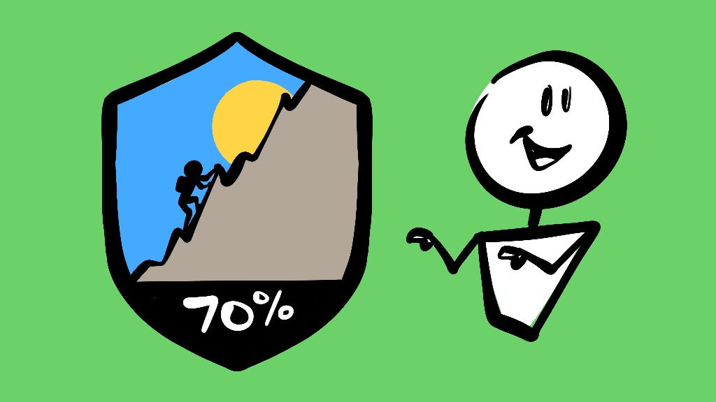
Solution #3: “70% confident”
I think “70% confident” has been kicking around for a while, but Jeff Bezos articulated it well in his 2016 letter to shareholders (emphasis mine):
Most decisions should probably be made with somewhere around 70% of the information you wish you had. If you wait for 90%, in most cases, you’re probably being slow. Plus, either way, you need to be good at quickly recognizing and correcting bad decisions. If you’re good at course correcting, being wrong may be less costly than you think, whereas being slow is going to be expensive for sure.
In leadership, I find “70% confident” to be a particularly effective communication tool. It explicitly calls out risk appetite, encourages a level of uncertainty, and identifies a sweet spot between not enough planning and analysis paralysis. Progress only happens with a certain degree of risk.
I’m excited to start sharing what we’ve been working on. Stay tuned for new developer tools, powerful updates to WordPress.com, and tips for making the perfect pizza dough. If you’d like some additional reading material, here is a list of my favorite leadership books.
There are currently very few options for individual users to control how their content is used for AI training, and we want to change that. That’s why we’re launching a new tool that lets you opt out of sharing content from your public blogs with third parties, including AI platforms that use such content for training models.
The reality is that AI companies are acquiring content across the internet for a variety of purposes and in all sorts of ways. We will engage with AI companies that we can have productive relationships with, and are working to give you an easy way to control access to your content.
We’re also getting ahead of proposed regulations around the world. The European Union’s AI Act, for example, would give individuals more control over whether and how their content is utilized by the emerging technology. We support this right regardless of geographic location, so we’re releasing an opt-out toggle and working with partners to ensure you have as much control as possible regarding what content is used.
To opt out, visit the privacy settings for each of your sites and toggle on the “Prevent third-party data sharing” option.
Please note: If you’ve already chosen in your settings to discourage search engines from crawling your site, we’ve automatically applied that privacy preference to third-party data sharing.
We already discourage AI crawlers from gathering content from WordPress.com and will continue to do so, save for those with which we partner. We want to represent all of you on WordPress.com and make sure that there are protections in place for how your content is used. As part of that, we have added a setting to opt out of sharing your public site content with third parties. We are committed to making sure our partners respect those decisions.
The WordPress.com team is always working on new design ideas to bring your website to life. Check out the latest themes in our library, including great options for gamers, writers, and anyone else who creates on the web.
This magazine-style theme was built with gaming bloggers in mind, but is versatile enough to work exceptionally well for nearly any type of budding media empire. Using a classic blogging layout, we’ve combined modern WordPress technology—Blocks, Global Styles, etc.—with a nostalgic aesthetic that hearkens to the earlier days of the internet.
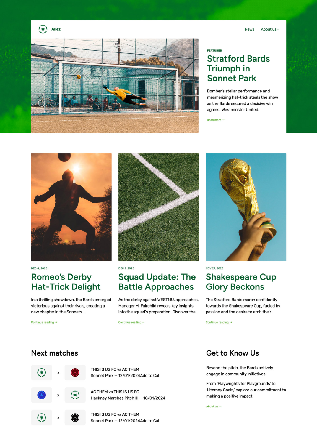
Whether you’re a casual observer or a diehard rain-or-shine follower, fandom means a lot of things to a lot of people. Allez is a perfect theme to chronicle that part of who you are. Built with sports-focused content in mind, the layout, styling, and patterns used all speak to that niche. That said, WordPress is versatile enough that if you like the overall feel of Allez, it can easily be customized to your particular endeavor.
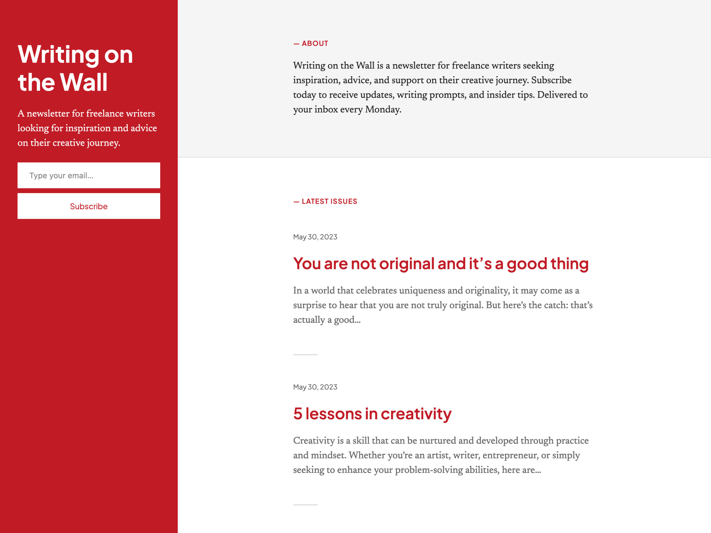
Strand is a simple newsletter and blogging theme with a split layout, similar to Poesis. We placed the newsletter subscription form in the sticky left column, so that it’s always visible and accessible. It’s a simple design, but one we really like for the minimalist writer who puts more emphasis on words than visual panache.
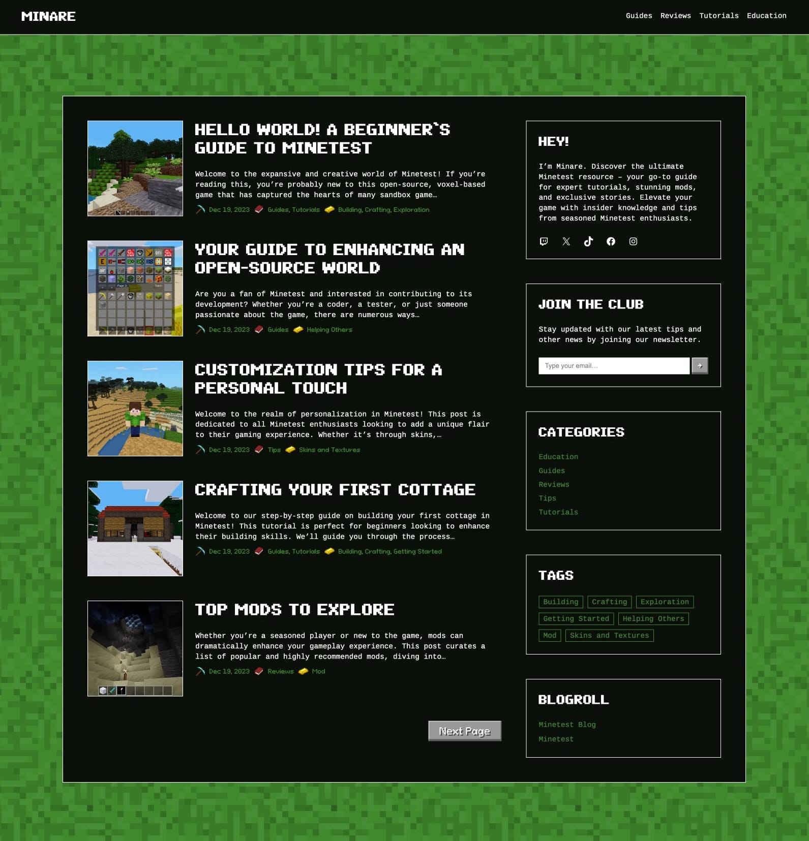
Inspired by the iconic worlds of Minecraft and Minetest (an open-source game engine), this blogging theme was designed to replicate the immersive experience of these games. While encapsulating the essence of virtual realms, we also wanted to ensure that the theme resonated with the Minecraft aesthetic regardless of the content it hosts.
At the heart of Bedrock is a nostalgic nod to the classic blog layout, infused with a distinctive “mosaic” texture. The sidebar sits confidently on every page and houses a few old-school elements like a tag cloud, a blogroll, and recent posts, all rendered with a touch of the game’s charm. If this theme speaks to you, give it a shot today.
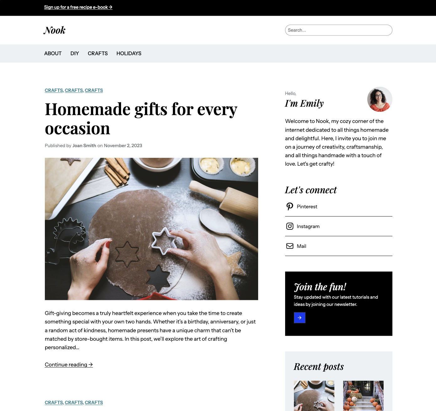
Nook is another blogging theme that offers a delightful canvas for your DIY projects, delicious recipes, and creative inspirations. It’s also easily extensible to add paid products or courses. Our aim here was to create an elegant and timeless look with a sense of warmth and familiarity. The typography and color palette feature high-contrast elements that evoke coziness and comfort.
To install any of the above themes, click the name of the theme you like, which brings you right to the installation page. Then click the “Activate this design” button. You can also click “Open live demo,” which brings up a clickable, scrollable version of the theme for you to preview.
Premium themes are available to use at no extra charge for customers on the Explorer plan or above. Partner themes are third-party products that can be purchased for $79/year each.
You can explore all of our themes by navigating to the “Themes” page, which is found under “Appearance” in the left-side menu of your WordPress.com dashboard. Or you can click below:
El equipo del proyecto WordPress sigue trabajando para mejorar el editor del sitio: el centro neurálgico desde donde editar y diseñar tu web.
La última tanda de actualizaciones (Gutenberg 17.4 y 17.5) incluye un montón de pequeños pero potentes cambios diseñados para mejorar la experiencia de WordPress tanto para ti como para los visitantes de tu web.
Échales un vistazo a las novedades.
Revisiones de estilo más sólidas
Créditos de la imagen: WordPress.org
Cuando estás en estado de plena concentración realizando cambios en el aspecto de tu web, a veces te bloqueas o te das cuenta de que la versión que hiciste hace dos o tres cambios de color y tipografía era mejor que la de ahora. La actualización del panel de las revisiones de estilo ofrece un registro detallado de los cambios que has ido realizando en el diseño, para que puedas volver atrás en el tiempo de forma fácil y con un solo clic.
Para que sea aún más potente, también se ha añadido paginación y un control más detallado de los elementos.
Puedes acceder a las revisiones de estilo desde el editor del sitio, haciendo clic en el icono «Estilos» en la parte superior derecha de la página y luego en el icono del reloj «Revisiones».
Panel de preferencias unificado
Créditos de la imagen: WordPress.org
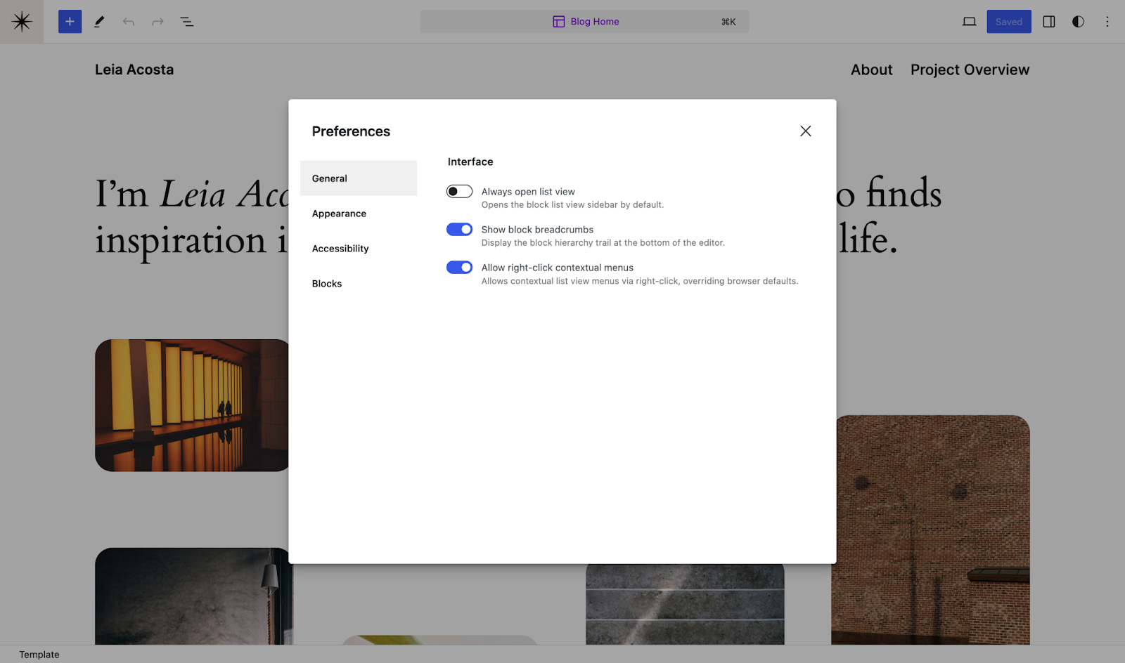
Ahora es mucho más sencillo gestionar las preferencias de tu web y de la edición de las entradas, que se han combinado y mejorado en la última actualización. Además de otros ajustes ya conocidos, verás nuevas opciones de accesibilidad y apariencia, así como un botón de «Permitir clic derecho» para anular los molestos ajustes predeterminados de algunos navegadores. Para acceder a las preferencias, haz clic en el menú de tres puntos en la parte superior derecha del editor y después en «Preferencias» en la parte inferior.
Galería de imágenes aleatorias
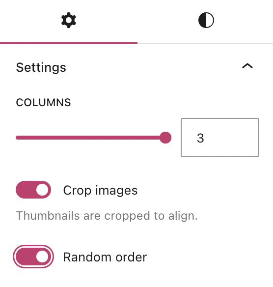
El bloque Galería siempre ha sido una buenísima manera de exponer una serie de fotos o imágenes. Ahora tiene una nueva y curiosa opción: aleatorizar el orden en el que aparecen las imágenes cada vez que un nuevo visitante carga la página o entrada.
Puedes activar esta opción en un botón en la parte inferior del panel de ajustes del bloque:
Edita directamente en la vista de lista
Créditos de la imagen: WordPress.org
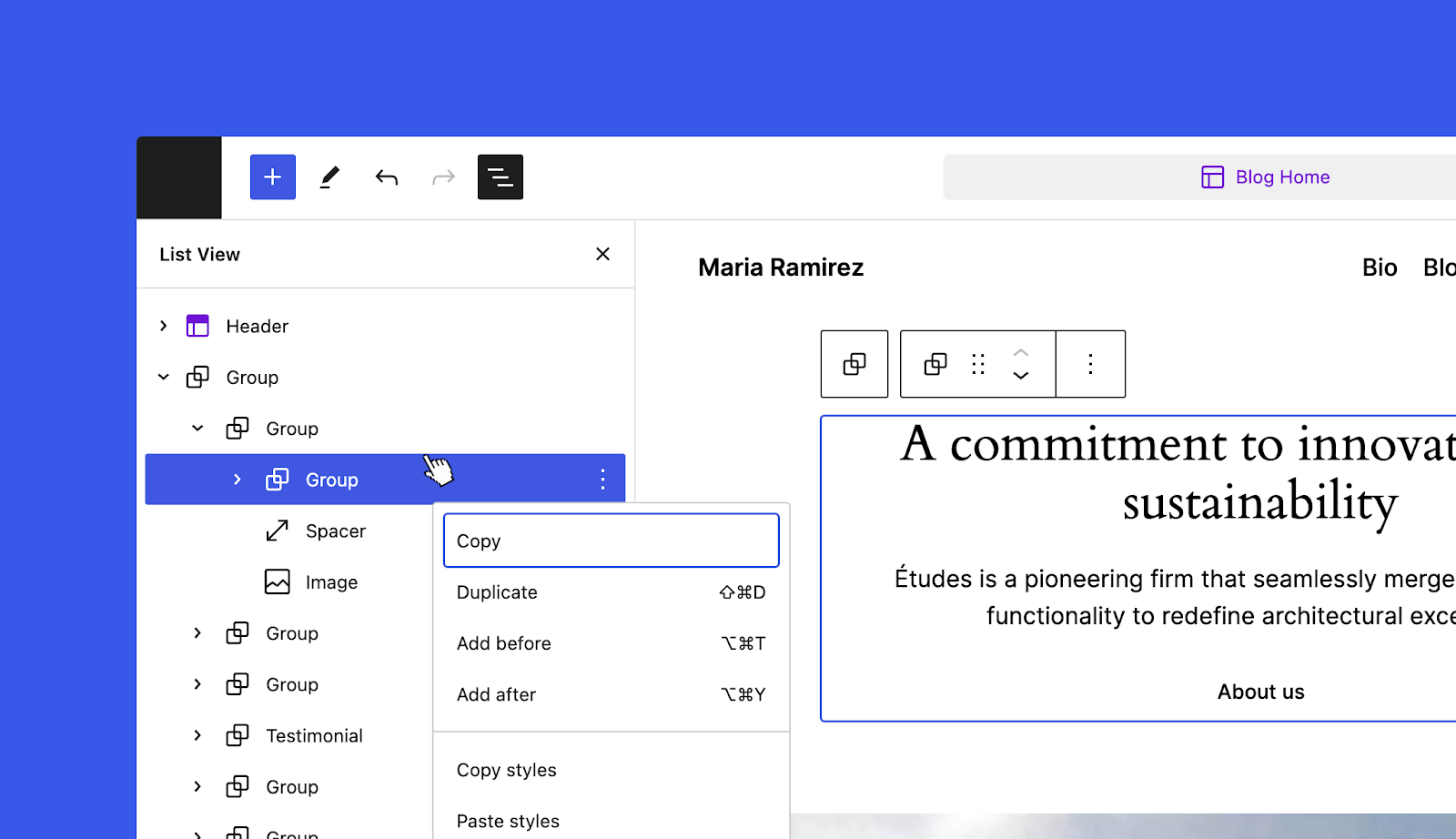
No todo el mundo conoce la vista de lista del editor del sitio, pero gracias a ella puedes editar tu web, páginas y entradas de una forma considerablemente más rápida y sencilla. La mejora que se ha añadido hace que editar los elementos sea aún más fácil: solo tienes que hacer clic derecho en cualquier elemento de la lista para abrir un menú de ajustes del bloque seleccionado.
Hasta los cambios más pequeños pueden marcar la diferencia en tu ritmo de trabajo y en la experiencia general de los visitantes de tu web.
¡Nos encantaría saber qué opinas de estas nuevas funcionalidades!
The WordPress project team is continuously improving the Site Editor—your one-stop shop for editing and designing your site.
The latest batch of updates—Gutenberg 17.4 and 17.5—include a handful of small but powerful changes designed to improve both your WordPress experience and that of your site’s visitors.
Let’s take a look at what’s new.
More robust style revisions
Image credit: WordPress.org
When you’re in the zone making changes to the look and feel of your site, you sometimes hit a dead end or realize that the version you had three or four font and color tweaks ago was a bit better. The updated style revisions pane gives you a robust, detailed log of the design changes you’ve made and makes turning back the clock easier with a one-click restore option to take you back to that perfect design.
Newly added pagination and more granular details make this feature even more powerful.
You can access style revisions from the Site Editor by clicking the “Styles” icon on the top right of the page, and then clicking the “Revisions” clock icon.
Unified preferences panel
Image credit: WordPress.org
It’s now much easier to manage your site and post-editing preferences, which have been combined and enhanced in the latest update. In addition to familiar settings, you’ll find new appearance and accessibility options, and an “allow right click” toggle which allows you to override stubborn browser defaults. You can access your preferences by heading to the three-dot menu at the top right of the editor and clicking “Preferences” at the bottom.
Randomized gallery images
Video credit: WordPress.org
The Gallery Block’s always been a great way to show off a collection of photos or images. And now there’s a fun new setting to randomize the order in which those images appear every time the page or post is loaded by a new visitor.
You can turn this setting on with a toggle found at the bottom of the block settings pane:
Streamlined edits in List View
Image credit: WordPress.org
Not everybody knows about the Site Editor’s List View, but it can make editing your site, posts, and pages significantly faster and easier. A new addition to the List View makes editing even more convenient: just right-click any item in the list to open up the settings menu for the selected block.
Even small changes can make a big difference to your workflow, and your site visitor’s overall experience.
We’d love to hear what you think about the new features when you’ve had a chance to take them for a test drive!
Si estás pensando en crear una web o simplemente quieres mejorar la tuya, podemos ayudarte. Durante este mes de febrero tienes a tu disposición 3 webinars completamente gratuitos con los que aprenderás a crear el tema perfecto para tu web, crear contenido con ayuda de inteligencia artificial y posicionarlo en los motores de búsqueda.
Aquí tienes algunas razones por las que podrías necesitar estos webinars:
Mejora tu presencia online: aprenderás a crear un sitio web atractivo y funcional que te ayudará a destacar tu presencia online en un mundo digital ultra competitivo.
Genera nuevas ideas y contenido con solo un clic: crea contenido desde cero, mejora la calidad del que ya tienes o genera nuevas ideas con inteligencia artificial.
Aumenta tu visibilidad: aprenderás a utilizar herramientas para mejorar la visibilidad de tu contenido en los motores de búsqueda para generar más tráfico y oportunidades de negocio.
No te pierdas la oportunidad de aprender de expertos en WordPress y adquirir habilidades clave que te permitirán destacar en un mundo digital en constante evolución.
Tres webinars esenciales en español a los que puedes apuntarte desde ya haciendo clic a continuación. ¡Puedes apuntarte a todos los webinars que quieras!
HTTP/3 es la tercera versión principal del protocolo de transferencia de hipertexto que se utiliza para intercambiar información en Internet. Está construido sobre un nuevo protocolo llamado QUIC cuyo fin es enmendar algunas limitaciones de versiones anteriores del protocolo. Sin entrar en demasiado detalle técnico (aunque puedes hacerlo en los comentarios si tienes alguna duda), nuestros usuarios verán una mejora en el rendimiento en todas las métricas:
Latencia reducida: como la conexión se establece más rápidamente (es decir, da menos vueltas), la latencia al establecer la conexión es menor.
Multiplexación: es decir, usar una misma conexión para múltiples recursos. Aunque esta característica ya está presente en HTTP/2, HTTP/3 la ha mejorado y ha solucionado el problema del bloqueo de la cabecera de línea (head of line blocking). Esto es una deficiencia del protocolo subyacente sobre el que se construyó HTTP/2 que requiere que los paquetes estén en orden antes de enviarlos para su procesamiento.
Fiabilidad: diseñado para que funcione mejor en diferentes entornos de redes, HTTP/3 utiliza algoritmos modernos que le ayudan a recuperarse más rápidamente de la pérdida de datos y de las redes congestionadas.
Seguridad mejorada: QUIC utiliza los protocolos criptográficos más recientes (TLSv1.3) para cifrar y proteger la información. Se cifran más datos, así que es más difícil que alguien pueda manipular o husmear en las solicitudes web.
Además, HTTP/3 (al usar QUIC) se ha diseñado para que se actualice en el software, de forma que se puedan hacer rápidamente mejoras que no dependan de la infraestructura de red subyacente.
Después de estar un mes preparando nuestra infraestructura (solucionando errores y mejorando nuestra CDN), activamos HTTP/3 en todos los servicios de Automattic el 27 de diciembre de 2023. Ahora mismo se ocupa de aproximadamente el 25-35 % del tráfico.
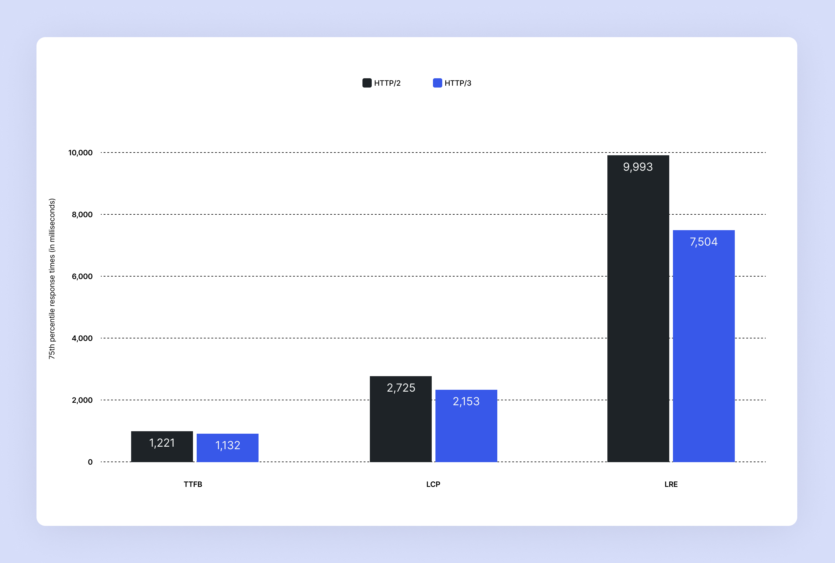
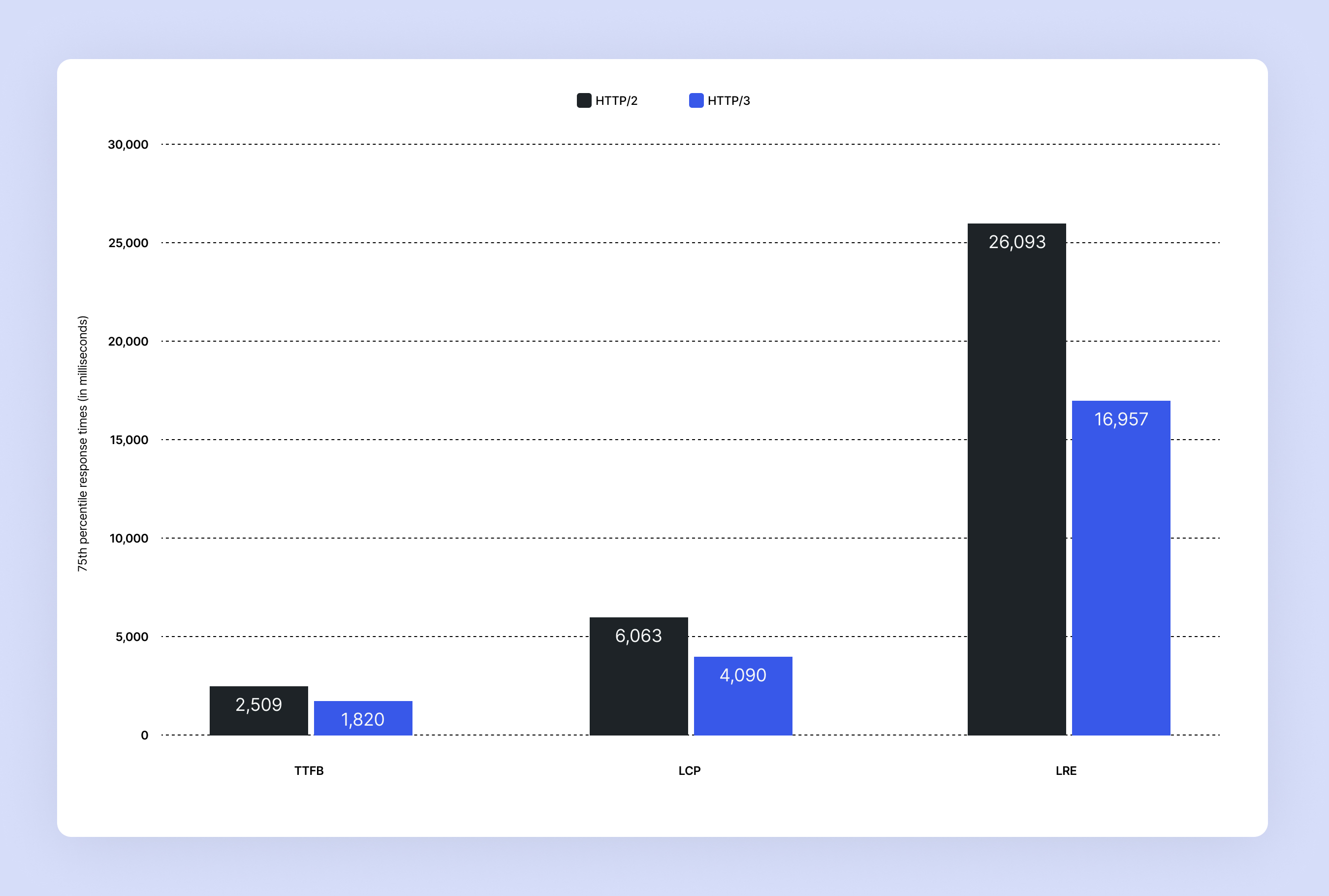
Y ahora vamos a echar un vistazo a algunas estadísticas. En cada apartado, queremos que los números sean más bajos una vez hecho el cambio, por que eso significa que la velocidad para nuestros clientes es más rápida en todos los aspectos. Nos interesan sobre todo tres datos:
El tiempo hasta el primer byte (Time to First Byte o TTFB) mide el tiempo entre que se solicita un recurso y que llega el primer byte de la respuesta.
El renderizado del elemento con mayor contenido (Largest Contentful Paint o LCP) representa lo rápido que se carga el contenido principal de una página web.
El final del último recurso (Last Resource End o LRE) mide el tiempo entre que se solicita un recurso y que llega la respuesta completa.
Resultados en conexiones rápidas: baja latencia y alto ancho de banda
Las mejoras pintan muy bien en las conexiones rápidas:
TTFB: 7,3 %
LCP: 20,9 %
LRE: 24,4 %
Resultados en conexiones lentas: alta latencia y bajo ancho de banda
En conexiones lentas, los resultados son aún mejores:
TTFB: 27,4 %
LCP: 32,5 %
LRE: 35 %
Tenemos el compromiso de ofrecer el mejor rendimiento posible a las webs de nuestros clientes. Implementar HTTP/3 es un paso más en esa dirección. ¡Nos vemos por aQUIC!
El propósito de Automattic es democratizar el acceso a la publicación. Para conseguirlo, estamos buscando ingenieros de sistemas que se unan al mejor equipo de infraestructuras del planeta. Más información aquí.
El equipo de WordPress.com siempre está trabajando en nuevos diseños para darle vida a tu web. Echa un vistazo a los últimos temas de nuestra biblioteca, incluyendo nuevas opciones para pequeñas empresas y emprendedores del ámbito del coaching y varios diseños espectaculares y muy versátiles.
Tu refugio literario en internet. Este tema está diseñado especialmente para los amantes de los libros. Incluye funcionalidades integradas como colecciones seleccionadas, integración para newsletter, una función de búsqueda sólida, adaptabilidad para móviles y mucho más. Tanto si tienes una librería física como si solo te apetece compartir tu entusiasmo literario con el mundo, Bookix es el tema de bloques ideal.
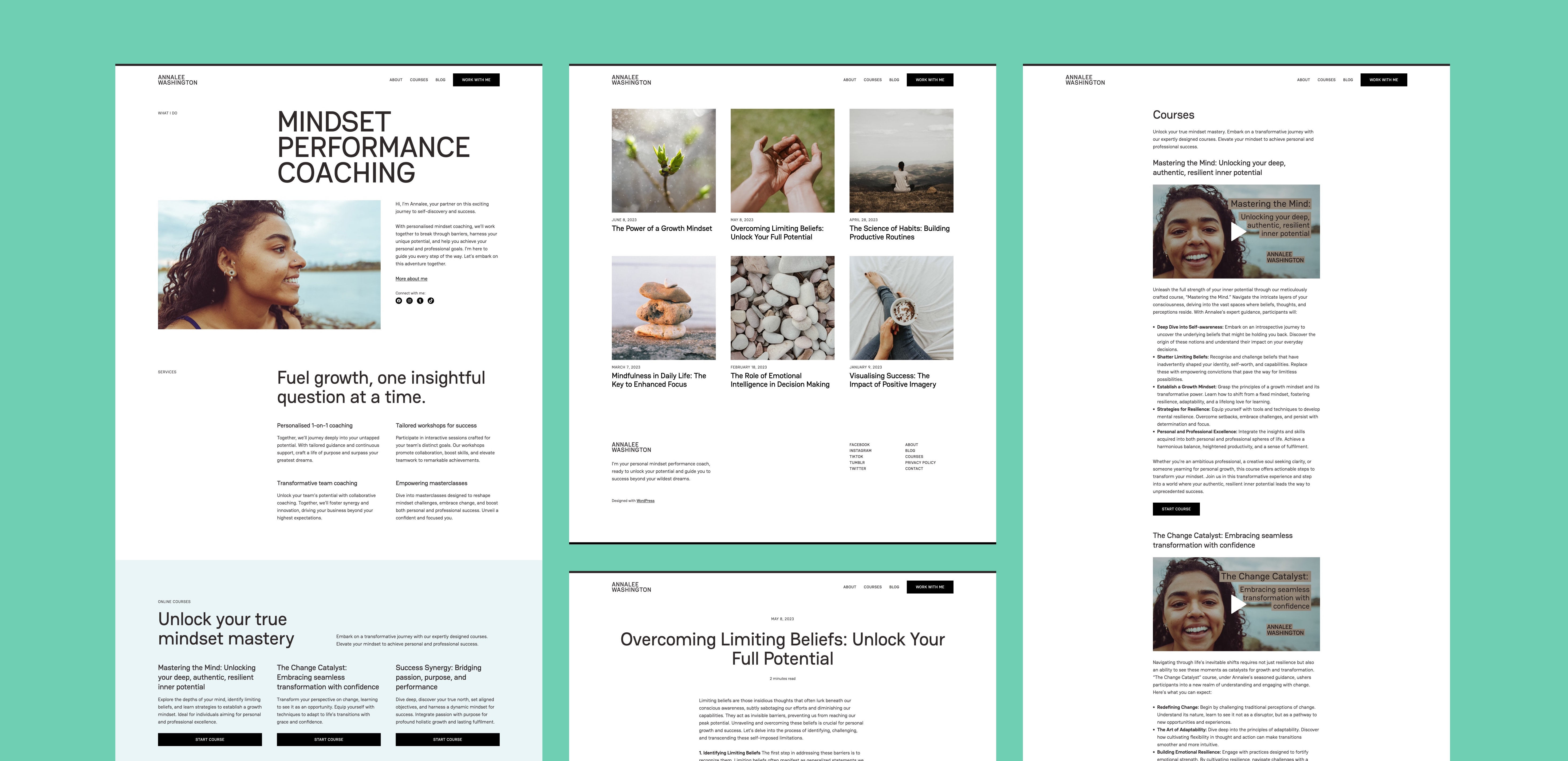
Annalee está especialmente diseñado para el coaching. Su página principal es directa e informativa a la vez que provee de opciones para vídeos, imágenes, cursos y más. Su diseño se caracteriza por los contrastes de color y tipografía y rezuma un ambiente acogedor y accesible. Annalee es perfecto para cualquier tipo de coach que quiera reforzar su marca y profesionalizar su presencia online.
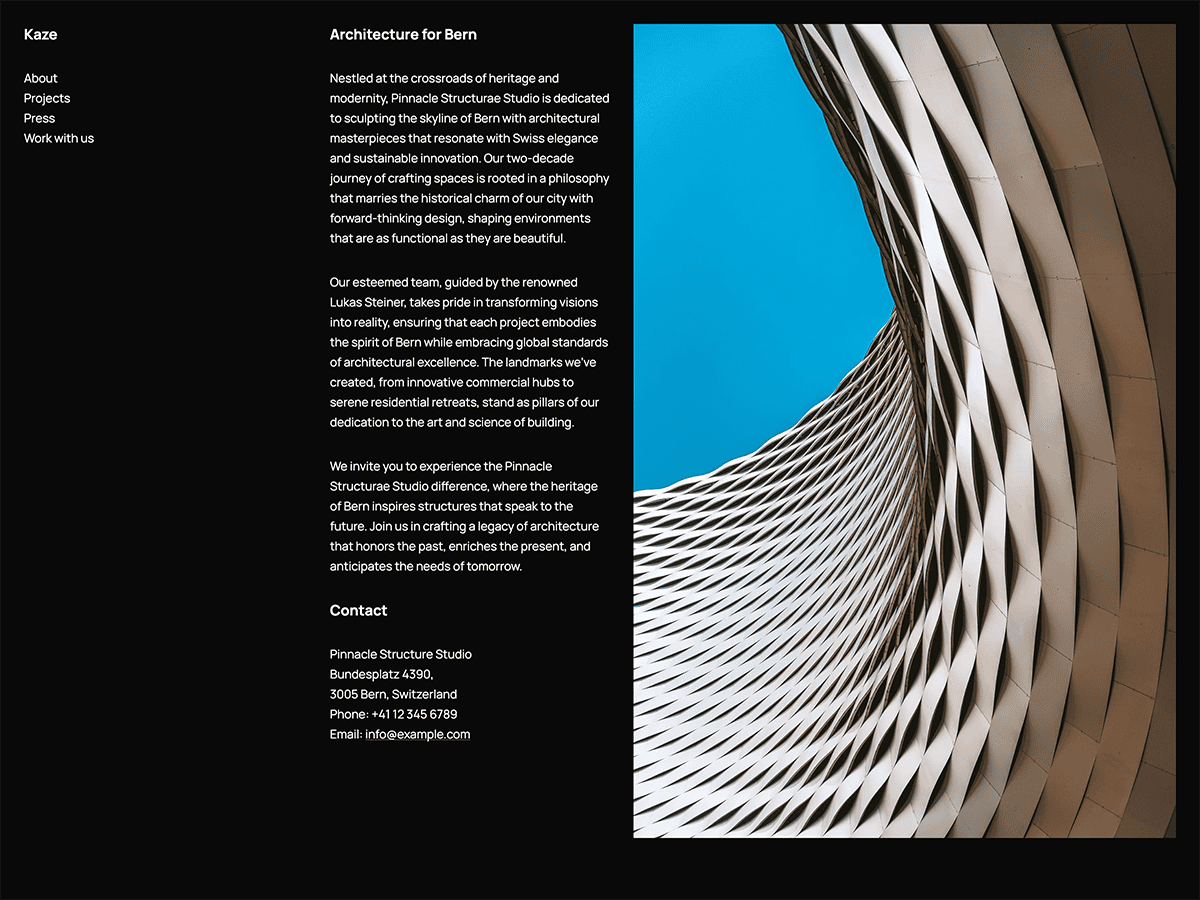
Kaze es un tema sencillo de tres columnas en el que la columna de la izquierda es un menú fijado, mientras que las dos de la derecha se desplazan. El amplio espacio en blanco (o negro, en este caso) se combina con una tipografía pequeña que le da un toque elegante y moderno. Aunque este tema está diseñado para estudios de arquitectura, lo puede utilizar cualquier pequeña empresa que quiera dar protagonismo al diseño y la profesionalidad.
Messagerie utiliza una interfaz de mensajería que gusta a todos para darle un estilo casual y divertido a tu blog. Consiste en bocadillos de texto sin adornos en un fondo sencillo, así no tendrás que preocuparte con complicados extras o imágenes para llamar la atención: deja que las palabras hablen por sí solas.
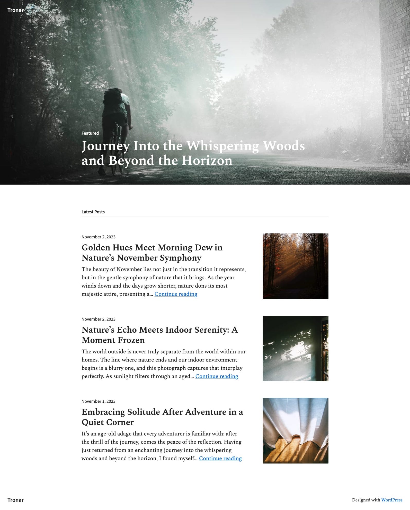
Construido a partir de uno de nuestros temas clásicos para blogs (Resonar), Tronar ofrece un diseño elegante para blogueros que quieran combinar un poco de la nostalgia del internet de antes con la simplicidad moderna. Incluye una imagen o entrada destacada inmersiva y de gran tamaño en la parte superior y un listado de entradas debajo: este tema le da todo el protagonismo a tu contenido.
Para instalar cualquiera de estos temas, haz clic en el nombre del tema que te guste y te llevará a la página de instalación. Allí, haz clic en el botón «Activar este diseño». También puedes hacer clic en «Abrir la versión de demostración» y ver una versión del tema en la que puedes desplazarte e interactuar.
Los temas premium son gratuitos para aquellos que tengan un plan Premium o superior. Los temas de pago son productos de terceros y se pueden comprar desde 87 € al año cada uno.
Puedes echar un vistazo a todos nuestros temas en la página «Temas», en la sección «Apariencia» del menú lateral izquierdo del escritorio de WordPress.com. O puedes hacer clic en el botón: